There’s a bit of a furore going on at the moment: it turns out that a controversial paper in the debate about the after-effects of the financial crisis had some peculiarities in its data analysis.
Rortybomb has a great description, and the FT’s Alphaville and Tyler Cowen have interesting comments.
In summary, back in 2010 Carmen Reinhart and Kenneth Rogoff published a paper Growth in a time of debt in which they claim that “median growth rates for countries with public debt over 90 percent of GDP are roughly one percent lower than otherwise; average (mean) growth rates are several percent lower.” Reinhart and Rogoff didn’t release the data they used for their analysis. Since then, apparently, people have tried and failed to reproduce the analysis that gave this result.
Now, a paper has been released that does reproduce the result: Herndon, Ash and Pollin’s Does High Public Debt Consistently Stifle Economic Growth? A Critique of Reinhart and Rogoff,
Except that it doesn’t, really. Herndon, Ash and Pollin identify three issues with Reinhart and Rogoff’s analysis, which mean that the result is not quite what it seems at first glance. It’s all to do with the weighted average that R&R use for the growth rates.
First, there are data sets for 20 countries covering the period 1946-2009. R&R exclude data for three countries for the first few years. It turns out that those three countries had high debt levels and solid growth in the omitted periods. R&R didn’t explain these exclusions.
Second, the weights for the averaging aren’t straightforward (or, possibly, they are too straightforward). Rortybomb has a good explanation:
Reinhart-Rogoff divides country years into debt-to-GDP buckets. They then take the average real growth for each country within the buckets. So the growth rate of the 19 years that the U.K. is above 90 percent debt-to-GDP are averaged into one number. These country numbers are then averaged, equally by country, to calculate the average real GDP growth weight.
In case that didn’t make sense, let’s look at an example. The U.K. has 19 years (1946-1964) above 90 percent debt-to-GDP with an average 2.4 percent growth rate. New Zealand has one year in their sample above 90 percent debt-to-GDP with a growth rate of -7.6. These two numbers, 2.4 and -7.6 percent, are given equal weight in the final calculation, as they average the countries equally. Even though there are 19 times as many data points for the U.K.
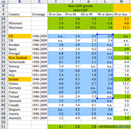
Third, there was an Excel error in the averaging. A formula omits five rows. Again, Rortybomb has a good picture:
Oops!
So, in summary, the weighted average omits some years, some countries, and isn’t weighted in the expected way. It doesn’t seem to me that any one of these is the odd man out, and I don’t think it really matters why either of the omissions occurred: in other words, I don’t think this is a major story about an Excel error.
I do think, though, that it’s an excellent example of something I’ve been worried about for some time: should you believe claims in published papers, when the claims are based on data analysis or modelling?
Let’s consider another, hypothetical, example. Someone’s modelled, say, the effects of differing capital levels on bank solvency in a financial crisis. There’s a beautifully argued paper, full of elaborate equations specifying interactions between this, that and the other. Everyone agrees that the equations are the bee’s knees, and appear to make sense. The paper presents results from running a model based on the equations. How do you know whether the model does actually implement all the spiffy equations correctly? By the way, I don’t think it makes any difference whether or not the papers are peer reviewed. It’s not my experience that peer reviewers check the code.
In most cases, you just can’t tell, and have to take the results on trust. This worries me. Excel errors are notorious. And there’s no reason to think that other models are error-free, either. I’m always finding bugs in people’s programs.
Transparency is really the only solution. Data should be made available, as should the source code of any models used. It’s not the full answer, of course, as there’s then the question of whether anyone has bothered to check the transparently provided information. And, if they have, what they can do to disseminate the results. Obviously for an influential paper like the R&R paper, any confirmation that the results are reproducible or otherwise is likely to be published itself, and enough people will be interested that the outcome will become widely known. But there’s no generally applicable way of doing it.
